
AI image generation is becoming an important part of podcast production. A strong visual can help a new episode stand out in social feeds, make a show look more professional, and give listeners a clearer idea of what an episode is about.
But choosing an image model is not always straightforward. A model may create an impressive image from one prompt and struggle with another. For podcast creators, image quality is only one part of the equation. Text accuracy, visual consistency, creative control, and editing time matter just as much.
To compare Grok Image 2 and GPT Image 2 fairly, we used the same prompts, the same podcast concepts, and the same evaluation criteria.
Our Test Setup
We created a fictional podcast called Signal & Story, a show about technology, creativity, and the future of media.
Each model received the same basic creative Brief:
You are creating visual assets for a fictional podcast called “Signal & Story.”
Podcast topic: technology, creativity, and the future of media.
Target audience: creators, marketers, and technology enthusiasts.
Podcast topic: technology, creativity, and the future of media.
Target audience: creators, marketers, and technology enthusiasts.
Brand personality: intelligent, modern, curious, and approachable.
Preferred visual direction: clean editorial design with subtle futuristic elements.
Preferred colors: deep navy, white, electric blue, and warm orange accents.
The visual style should feel professional and suitable for a podcast brand.
Do not use real brands, celebrity likenesses, copyrighted characters, or additional logos.
We also tested prompts for:
-
A new episode about artificial intelligence
-
A social media quote card
-
A futuristic studio scene
-
A YouTube thumbnail
-
A consistent visual series for multiple episodes
We generated multiple versions for each test and recorded the results on the same day.
Links to the full set of test prompts are here:
https://docs.google.com/document/d/1smesB4KuvahKOxiLMdEfVQubAIPya5-CK_ielyeJhTc/edit?usp=sharing
Test Results
| Category | Grok Image 2 | GPT Image 2 |
|---|---|---|
| Prompt accuracy | 8/10 | 8/10 |
| Text rendering | 9/10 | 9/10 |
| Visual quality | 8/10 | 9/10 |
| Creative control | 8/10 | 9/10 |
| Style consistency | 8/10 | 8/10 |
| Production usefulness | 8/10 | 8/10 |
| Total | 49/60 | 51/60 |
| Average | 8.2/10 | 8.5/10 |
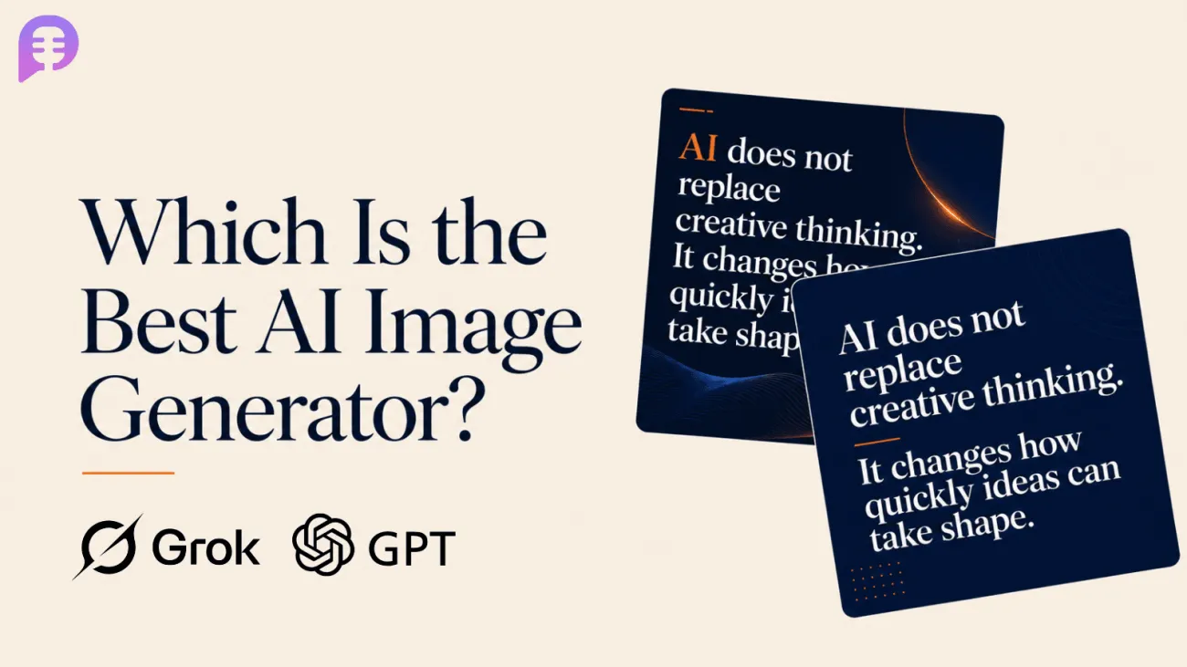
Based on our three round test, GPT Image 2 scored slightly higher overall, mainly because of its stronger editorial composition and broader creative control. Grok Image 2 performed particularly well in audio-focused visuals, text accuracy, and focused podcast cover exploration. These scores are directional rather than definitive benchmarks, since the test was based on a limited number of outputs.
Round 1: Open-Ended Brief Test
For the first round, we gave Grok Image 2 and GPT Image 2 the same basic brief for a fictional podcast called Signal & Story. The brief included the podcast topic, target audience, brand personality, preferred visual direction, and color palette, but did not specify the exact layout, number of assets, or copy.
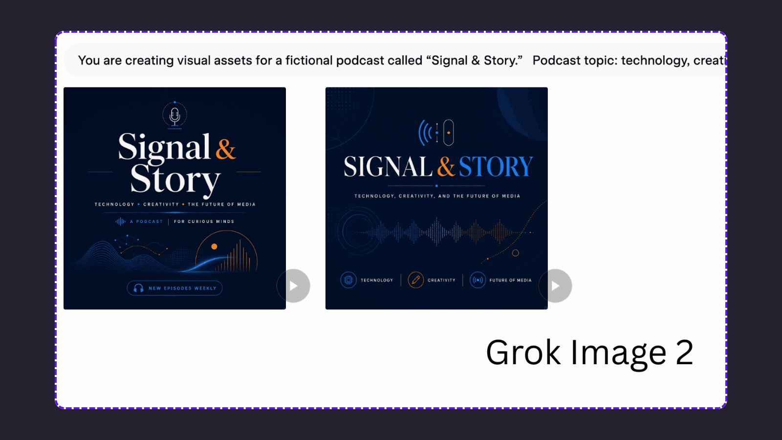
At the beginning of the Grok workflow, we selected a square 1:1 format. Grok generated two square podcast cover concepts using a consistent navy, blue, and orange color palette. Both images clearly reflected the podcast’s technology and audio themes. However, Grok also added unrequested taglines, category labels, and play-button graphics.
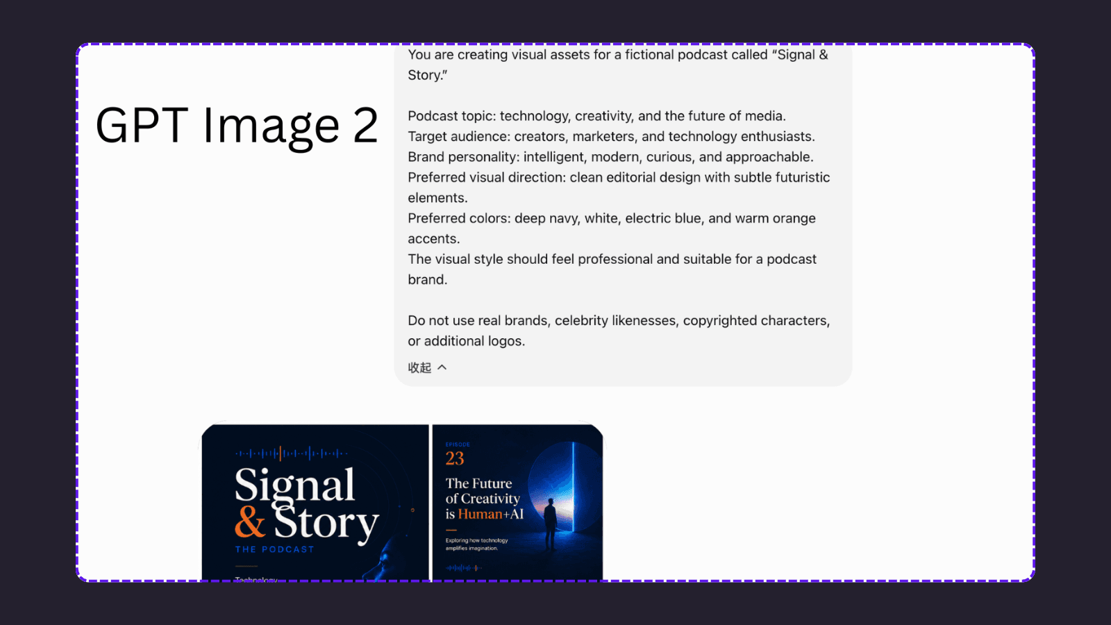
GPT Image 2 interpreted the same brief more broadly. Instead of producing only cover concepts, it created a multi-panel visual board with a main cover, episode artwork, quote card, promotional graphic, and topic icons. This showed stronger visual-system thinking, but it also introduced extra information such as an episode number, episode title, taglines, and platform-style icons.
The first round did not produce an overall winner. Grok’s result was more focused on exploring 1:1 podcast cover concepts, while GPT’s result was closer to a broader podcast branding proposal. Since the two tools produced different output formats, the next round will use a stricter prompt and fixed requirements for a more direct comparison.
Round 2: A Controlled Podcast Cover Test
In the second round, we used the same detailed prompt for both models and fixed the output format to a square 1:1 podcast cover.
Both models followed the main requirements successfully. They generated one standalone cover, used the exact title “Signal & Story,” and did not add extra words, subtitles, or logos.
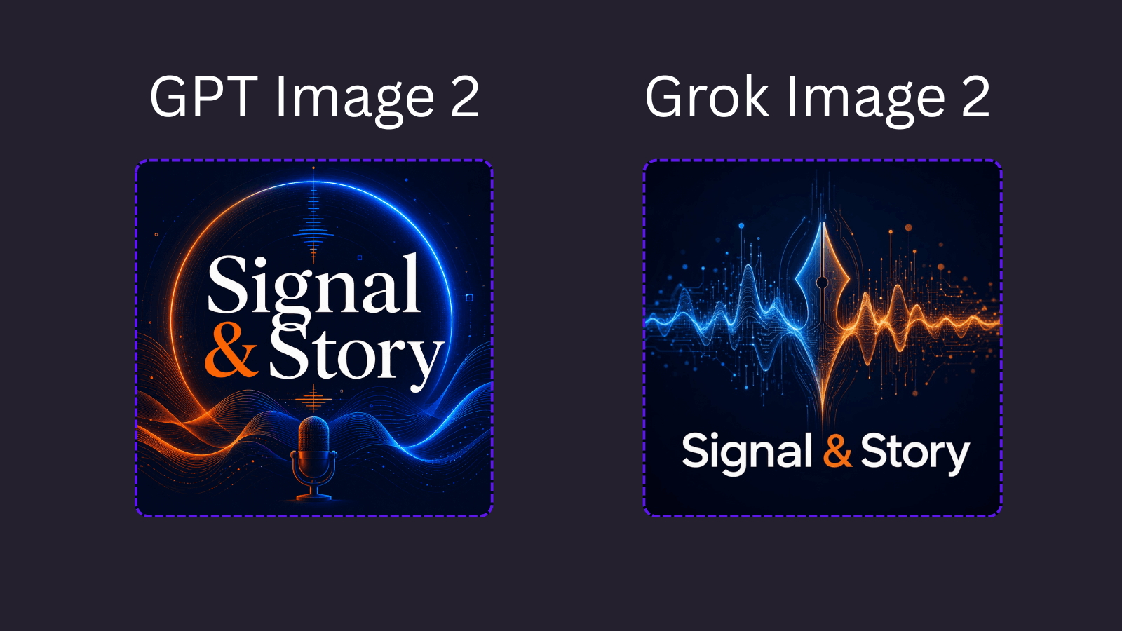
GPT Image 2 created a more traditional podcast cover. It placed the title prominently in the center, combined it with a microphone and circular signal design, and established a clear visual hierarchy. The result is easy to recognize as podcast artwork and remains readable at a smaller size.
Grok Image 2 took a more abstract direction. It focused on audio waveforms, digital particles, and a central technology-inspired symbol. The podcast title was placed at the bottom, leaving more space for the visual concept above it. This made the design feel more experimental and closely connected to the relationship between audio and technology.
Based on this round, GPT Image 2 had a slight advantage in title prominence and immediate podcast recognition, while Grok Image 2 offered a more abstract and visually expressive interpretation. Both models followed the prompt accurately, so the better choice depends on whether the creator values clarity and thumbnail readability or a more conceptual visual style.
Round 3: Text Rendering Test
For the third round, we tested both models with the same quote-card prompt. The goal was to evaluate text accuracy, readability, and the ability to follow a specific visual direction.
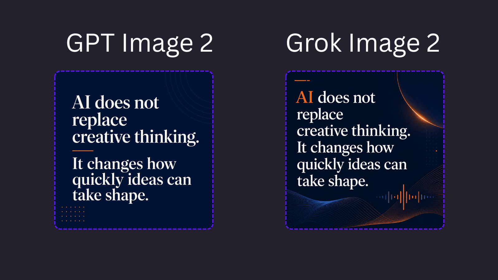
Both models reproduced the quote correctly and did not add extra words, names, logos, or attribution. GPT Image 2 took a more minimal editorial approach, using clean typography, a simple orange divider, and subtle background details. The quote hierarchy is clear and easy to read.
Grok Image 2 added more audio-related visual elements, including waveforms, an orange signal line, and a small decorative accent. This made the design feel more connected to the podcast identity, although it was slightly more visually complex than the GPT version.
In this round, both models passed the text-accuracy test. GPT Image 2 had a slight advantage in clean typography and readability, while Grok Image 2 created a stronger connection between the quote card and the podcast’s audio-focused identity.
What We Evaluated
We scored both models across six categories
Prompt Accuracy
Did the generated image follow the instructions?
We checked whether the model correctly understood the subject, format, mood, layout, and requested elements.
Text Rendering
Text is especially important for podcast covers and promotional graphics. We looked at:
-
Correct spelling
-
Missing words
-
Extra characters
-
Letter spacing
-
Readability at thumbnail size
-
Whether the title stayed visually prominent
Visual Quality
We evaluated the overall composition, lighting, color balance, subject placement, and professional appearance. A beautiful image is not necessarily useful if the title is difficult to read or the focal point is poorly positioned.
Creative Control
We tested whether the models could follow specific visual directions, such as:
-
Minimal editorial design
-
Bold tech aesthetic
-
Warm documentary photography
-
Clean geometric layouts
-
Dark cinematic lighting
Consistency
For podcasters, one good image is not enough. A show often needs a complete visual system. We tested whether each model could maintain a similar style across multiple episode graphics while changing the topic and headline.
Production Usefulness
Finally, we considered how much editing would be required before publishing.
A slightly less impressive image may be more useful if it requires fewer corrections and fits the content workflow more easily.
Final Takeaway
For podcast creators, neither model is a universal winner. In our three-round test, GPT Image 2 had a slight advantage in clean typography, structured layouts, and thumbnail readability. Grok Image 2 stood out for more expressive visuals built around audio, technology, and storytelling.
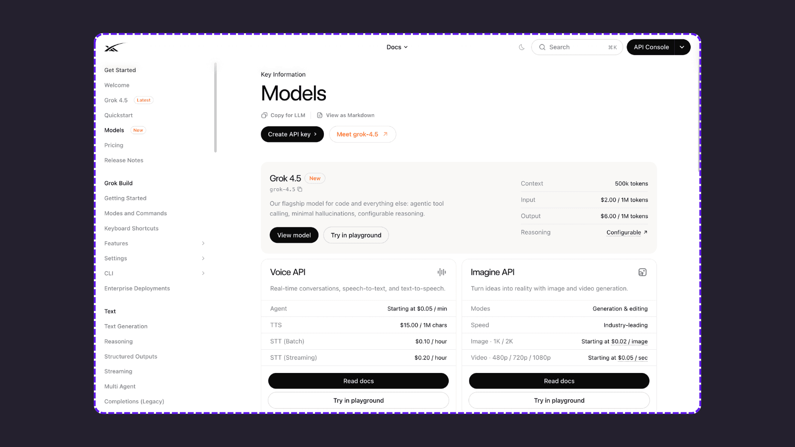
Price was not included in our quality score. According to the official documentation available at the time of writing, xAI lists Imagine API image generation for 1K and 2K images starting at $0.02 per image.
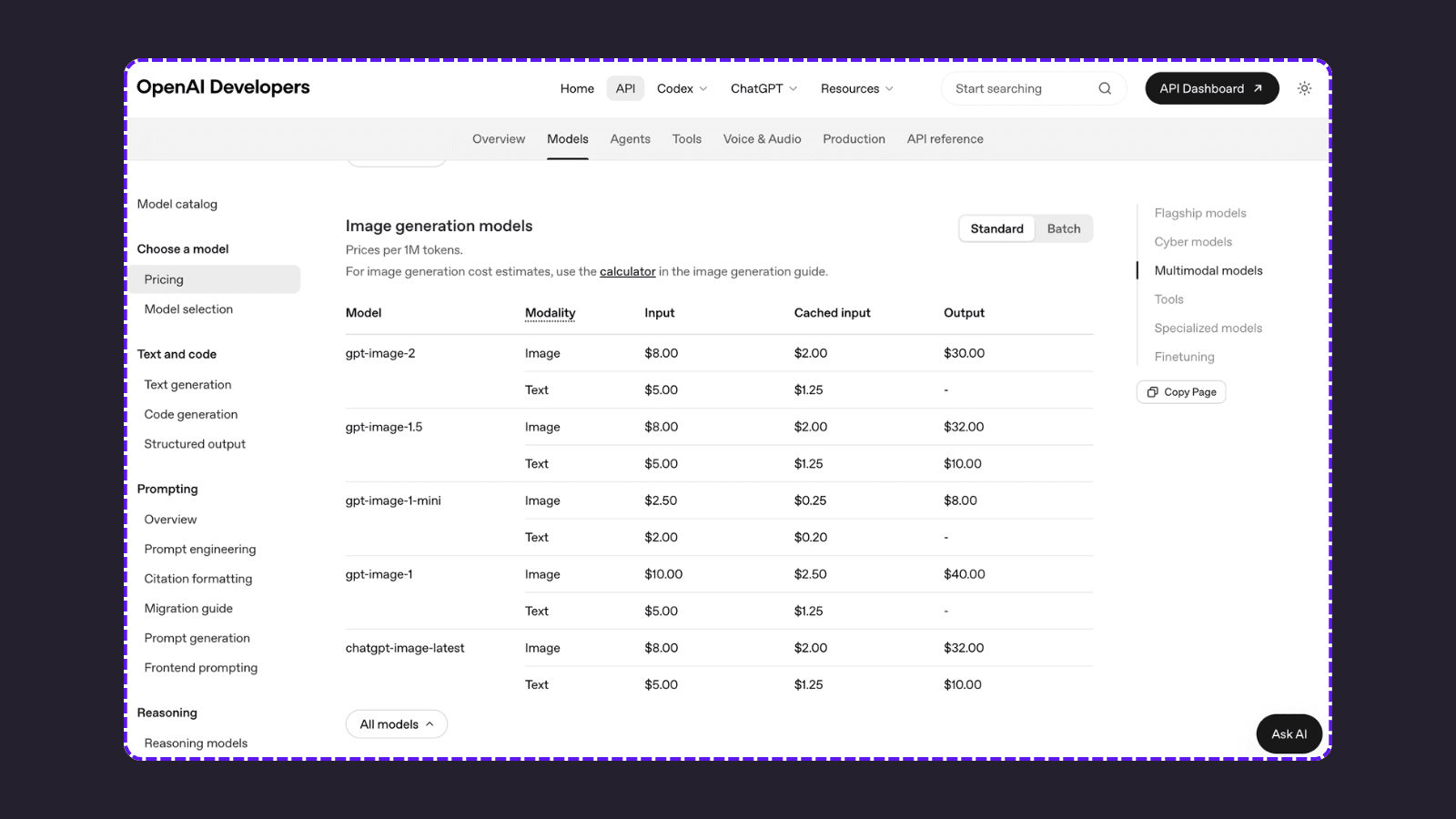
OpenAI lists GPT Image 2 using token-based pricing, including $8 per 1M image input tokens, $2 per 1M cached input tokens, and $30 per 1M output tokens.
For PodcastorAI workflows, GPT Image 2 may be the better starting point for polished podcast covers, quote cards, and text-heavy social media assets. Grok Image 2 may be a stronger choice for exploring bold visual concepts and more experimental podcast artwork.
Frequently Asked Questions
Which is better for podcast cover art: Grok Image 2 or GPT Image 2?
In our test, GPT Image 2 had a slight advantage in title prominence, layout clarity, and thumbnail readability. Grok Image 2 created more abstract audio-focused visuals. The better choice depends on whether you prioritize a clean podcast cover or a more experimental visual style.
Is GPT Image 2 good for podcast branding?
GPT Image 2 performed well in our test when the brief required a clear editorial composition and multiple related podcast assets. It expanded the basic brief into a broader visual system, including cover art, episode artwork, quote cards, and promotional layouts.
Is Grok Image 2 good for podcast artwork?
Grok Image 2 performed well for audio-focused podcast artwork. Its designs used waveforms, signal patterns, and technology-inspired graphics to create a stronger connection between sound and visual storytelling.