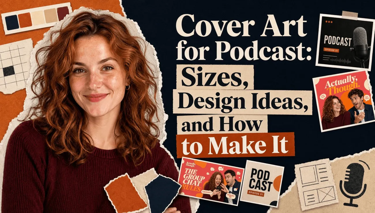

If you’re searching for podcast cover art sizes, requirements, or design ideas, you’re probably trying to solve two problems at once: making sure your artwork is accepted by Apple Podcasts and Spotify, and making it distinctive enough to earn a click in a crowded feed. A podcast cover may appear at postage-stamp size, but it is often the first signal of what a show feels like. The right dimensions and file format get you through the upload process; clear typography, strong contrast, and a memorable visual idea help listeners stop scrolling.
In this guide, I break down the exact cover art specifications for Apple Podcasts and Spotify, explain the difference between show covers, episode artwork, and YouTube thumbnails, and look at what effective podcast covers have in common. I also walk through how to choose a visual direction, create cover art with an AI cover generator, check it at thumbnail size, and keep the design consistent across episodes, so you can turn an initial idea into artwork that is ready to publish.
Podcast Cover Art Sizes and Requirements
| Apple Podcasts | Spotify | |
|---|---|---|
| Aspect ratio | 1:1 square | 1:1 square |
| Dimensions | 1400 x 1400 minimum, 3000 x 3000 maximum | 3000 × 3000 px recommended; Spotify’s show art guide suggests 1400–3000 px square |
| File format | JPEG or PNG | TIFF, PNG, or JPEG |
| Color space | RGB | sRGB, 24 bits per pixel |
| Transparency | Not allowed, no alpha channel | Flatten to a solid background |
| Resolution | 72 dpi | Highest available resolution |
| File size | No maximum published; Apple advises compressing artwork | Not specified |
Sources: A Podcaster’s Guide to RSS and the Apple Podcasts Show Cover specifications, plus Spotify’s cover art requirements and Spotify’s show art guide. One note on Spotify: embedded color profiles and orientation metadata are not supported, so flatten and strip metadata on export.
The safe bet is a 3000 x 3000 RGB JPG or PNG with no alpha channel. That single file satisfies both platforms, so you can set the specs aside and focus on the design.
Know what you’re making: show cover, episode art, and video thumbnails
These three get mixed up a lot, so it’s worth a quick breakdown. Your show cover is the main artwork that represents your podcast everywhere. It’s required. Episode art is optional and follows the same square format and specs. If you don’t upload one, platforms will just display your show cover instead. Apple actually recommends keeping episode art free of logos and heavy text, since episode titles already appear right beneath the image.
A YouTube thumbnail is a completely different asset. It’s 16:9, not square, and follows YouTube’s own specs. If you publish video episodes, design a separate 16:9 version, or generate both formats at the same time.
Design for the size people actually see
Almost nobody sees your cover at 3000 pixels. They see it in a list, roughly the size of a fingertip, surrounded by competitors. That rules out more than you’d think. Fine details vanish. Subtitles turn to mush. Low-contrast text disappears against the background. Spotify’s own advice is pretty direct: keep it simple, skip tiny text, no more than two fonts.
Before you commit to anything, shrink it to about 150 pixels wide and look at it next to five shows in your category. If it still reads, you have a cover. If it does not, no amount of detail at full size will save it.
Podcast Cover Art Ideas and Examples
Most effective podcast covers follow one of three directions: a portrait, a recognizable symbol, or a strong visual mood. Each one suits a different kind of show and gives you a useful starting point for your own design.
Portrait-Based Covers: Put Your Host Front and Center
If listeners come for the host, make the host the focus. This works particularly well for interviews, comedy, and solo commentary.
WTF with Marc Maron uses an illustrated portrait instead of a standard headshot. When the show launched, most podcast covers featured straightforward host photos, so the illustration immediately stood out in a crowded thumbnail grid. The lesson is simple: a familiar face creates connection, but a distinctive treatment makes it memorable. (Adweek)
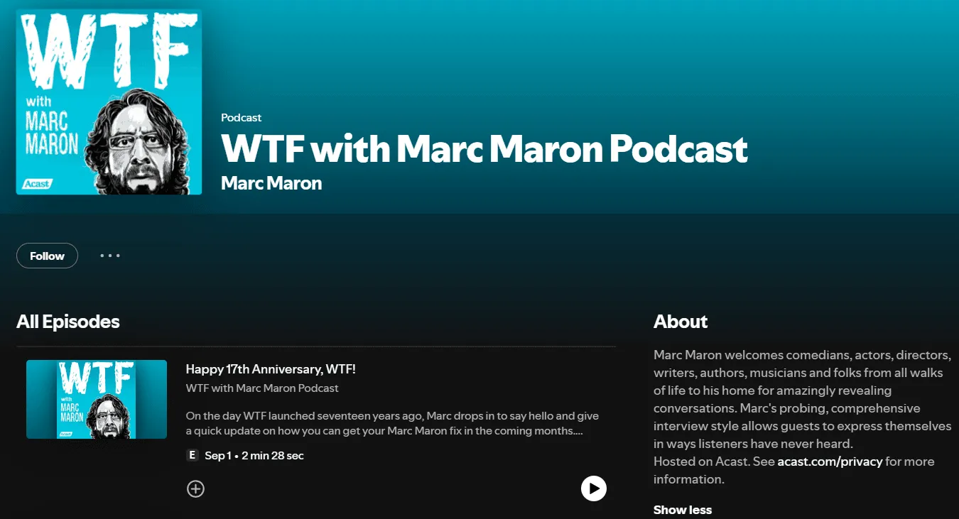
Treat a portrait as part of the design. A bold background, duotone effect, graphic shadow, or illustrated style will usually work better at thumbnail size than a plain photo on a busy backdrop. Look at other shows in your category, then decide whether your cover should blend in or break the pattern.
Symbol-Based Covers: Build Around One Recognizable Element
If your show is built around a subject rather than a personality, look for one object that captures its central idea and give it room to lead.
Freakonomics Radio does this particularly well. Its cover, adapted from the 2005 book, shows an apple sliced open to reveal an orange inside. The unexpected combination captures the show’s interest in finding what lies beneath the surface of familiar things. The hosts even nicknamed it the “orpple.” Because the image is bold, simple, and slightly surprising, it reads clearly at any size and works almost like a logo, making the show easy to recognize across hundreds of episodes. (Freakonomics)
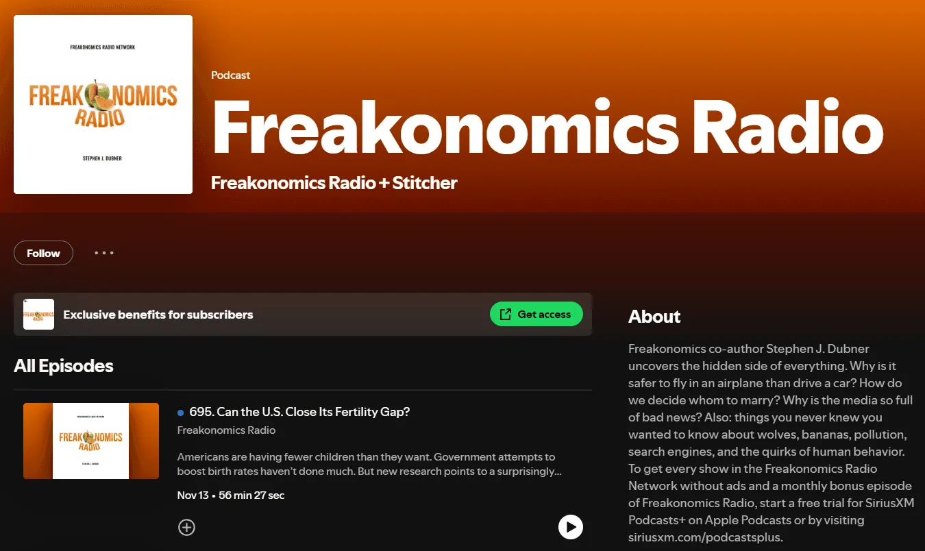
You do not need to copy the apple. Find an object that expresses your show’s angle in one glance. A thoughtful visual idea will say more than a literal illustration of your topic.
Mood-Based Covers: Set the Tone with Color and Imagery
Some podcasts are defined less by a person or a subject than by a feeling. For true crime, storytelling, music, and late-night essays, color, texture, and atmosphere can tell listeners what kind of experience to expect before they read a word.
Reply All is a memorable example. GrandArmy, with art direction by Joe Haddad, created a world of strange, glowing landscapes that felt bright and playful but carried a subtle sense of danger. A single lit cube appeared in each scene as a small point of truth within the surreal setting. The wordmark reinforced the concept by borrowing its look from the podcast’s URL in a browser bar. Together, these details made the show feel playful, slightly uncanny, and unmistakably internet-native. (GrandArmy, Joe Haddad)
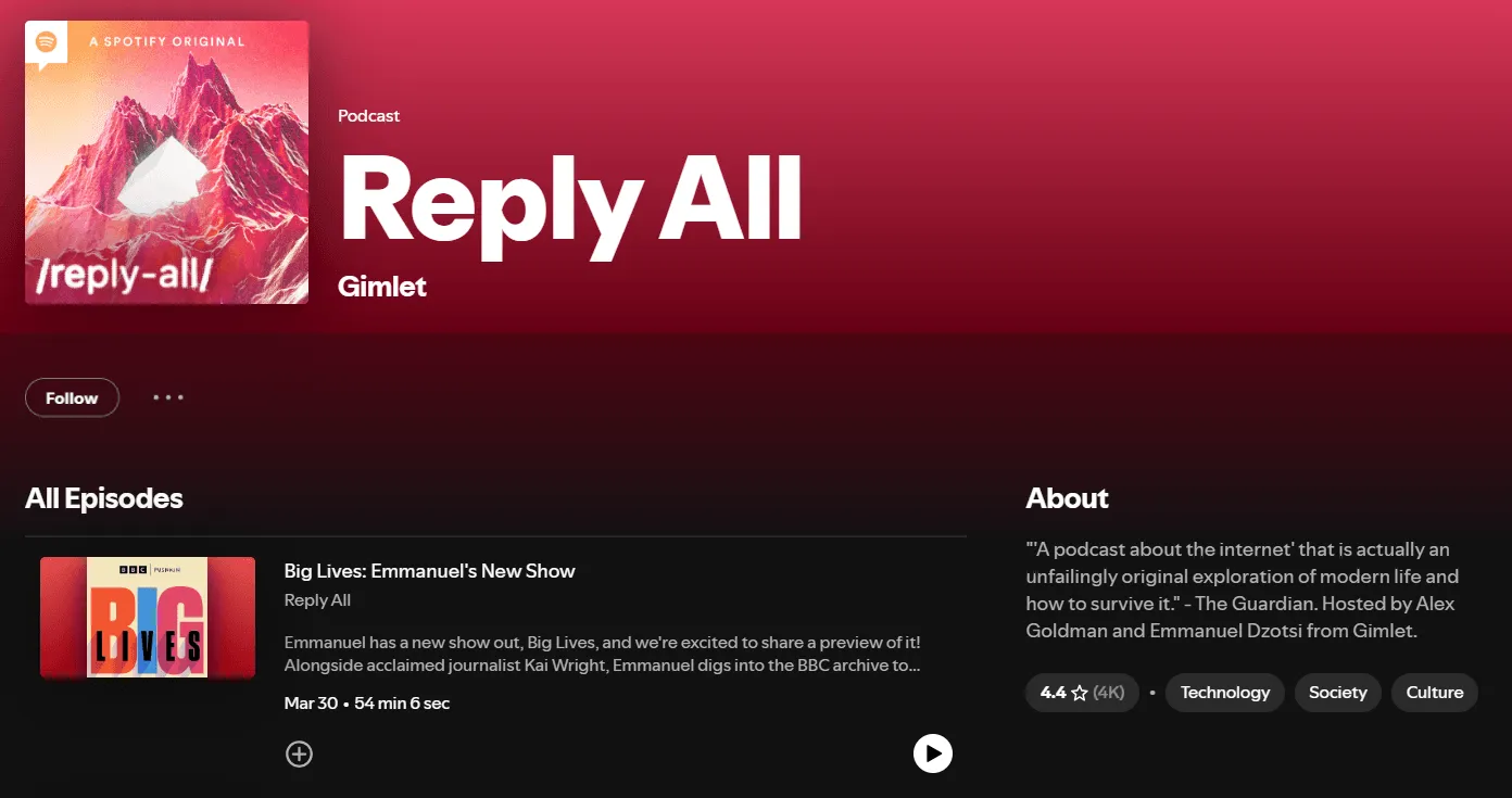
The risk with mood-based covers is stopping at vague words like “atmospheric” or “moody.” Those describe a feeling, but they do not give you something concrete to design. “Alien landscapes with a pixel of truth hidden inside them” is a usable concept; “moody and cool” is not. Start with a clear palette and one central image, then add a single detail that gives the cover its personality.
How to Make Cover Art for Your Podcast
You have three realistic routes, and the right one depends less on budget than on how settled your idea is.
Templates are the fast lane: cheap and quick. The catch is that a template gives you the same bones a lot of other shows are using, so your cover risks looking like theirs. Fine as a starting point if you just need to launch and plan to revisit the design later.
Hiring a designer is the other end. You get the strongest result and a proper identity to reuse everywhere, which pays off if your show is a business or a long-term project. The downside is cost and turnaround, which rarely works at per-episode scale.
AI generation lands in the middle, and it’s the sweet spot when you know the look you want but can’t build it yourself, or need fresh artwork too often to commission each one. You bring the direction; the tool handles the execution.
A worked example in PodcastorAI
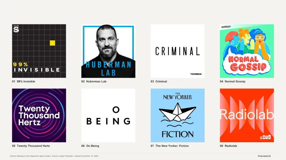
PodcastorAI includes an AI cover generator built for exactly this. You can describe your show and let it interpret the direction, or write your own prompt if you already know the look you want. It also lets you upload host references so the same faces carry across every cover, and exports in the ratios each platform expects, from the 1:1 square for Apple and Spotify to 16:9 for YouTube. There’s a gallery of real covers built in too, which is useful when you’re still figuring out your direction.
Here’s a full run through the tool, start to finish.
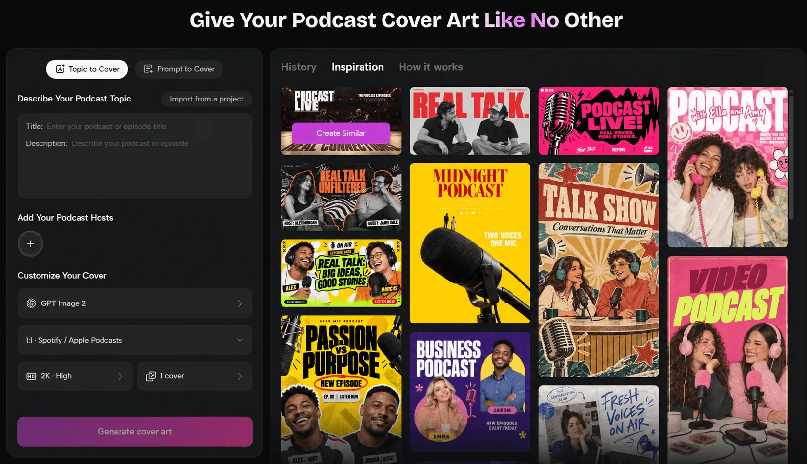
I used a fictional show I put together called Actually, Though. It’s a pop culture and lifestyle talk show hosted by a male and female duo, covering relationships, dating, internet culture, and the everyday questions that get people talking. Think honest opinions, friendly disagreements, and the kind of conversations that feel like catching up with two friends.
1. Decide what you’re asking for.
Before opening the tool, I settled on three things: the show name, its subject, and the visual direction.
The name sets the conversational tone on its own. The show covers pop culture, relationships, and modern life, with two hosts bringing different takes to each topic, and the audience is roughly 18 to 35, so the cover needed to feel current, expressive, and approachable.
I landed on a pop editorial style: two expressive host portraits, a vibrant coral-pink and orange palette, and bold typography. The goal was something closer to a contemporary lifestyle magazine cover than a traditional podcast graphic.
2. Give it your topic or your prompt.
The tool offers two ways in. Topic to Cover takes your show or episode title and description and interprets them for you, which is the better path when you know your content but haven’t settled on a look. Prompt to Cover hands you the controls, and it’s what you want when you already have the image in your head.
Since I’d already worked out the palette, the mood, and the kind of interaction I wanted between the hosts, I went with Prompt to Cover.
I also wanted the two hosts to read as recurring characters rather than stock faces. Emma is 27, with wavy auburn hair and freckles, and is quick to react. Jack is 29, with short dark curls and light stubble. They’re best friends with opposite instincts, and that contrast is the whole premise of the show.
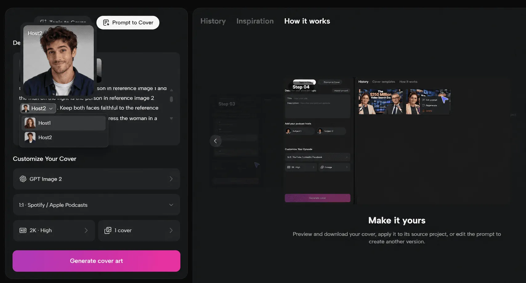
Rather than describe their faces in the prompt and hope for the best, I uploaded a reference portrait for each and dropped them into the prompt from the host picker, so the tool anchors to those exact faces every time.
Here is the prompt I used to guide the cover design:
A bold, contemporary podcast cover for a pop culture and lifestyle talk show called Actually, Though. Feature two co-hosts positioned side by side in a close-up editorial portrait: the woman on the left is the person in reference image 1, and the man on the right is the person in reference image 2. Keep both faces faithful to the reference images; do not alter their features. Dress the woman in a burgundy knit top and the man in a navy casual overshirt over a white T-shirt. Capture them mid-conversation: the woman laughing and turning to look at the man, while he reacts with a playfully surprised, mouth-open “wait, what?” expression and a raised hand mid-gesture. Use a vibrant coral-pink and warm orange background, with cream rounded shapes and small speech bubbles for a cute, playful feel. The overall aesthetic should feel like a modern American pop culture magazine: energetic, playful, confident, and visually distinctive. Strong composition, natural skin texture, realistic photography, bold color contrast, and enough clear space for the show title. Square 1:1 composition. No extra people, distorted faces, or watermarks.
The prompt works because it gives the tool more than a general subject. It defines the hosts, their appearance and expressions, the composition, the color palette, and the overall mood. Those details help turn a broad idea like “a fun two-host podcast” into a much more recognizable visual identity.
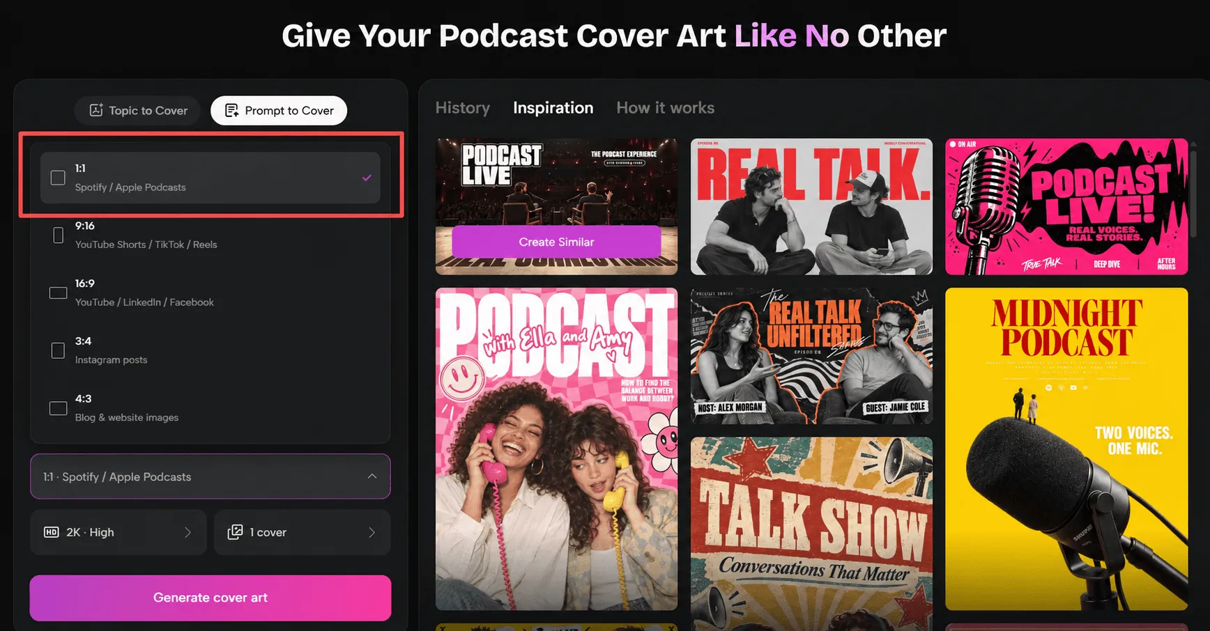
3. Choose your settings and generate. For this show, I chose the square 1:1 format rather than a landscape layout. A square cover works better as the primary artwork on Apple Podcasts and Spotify, and gives the two host portraits enough room to stand out.
I also generated a few variations instead of settling on the first result. Some versions might give more space to the title, while others might bring the hosts closer together. I compared them at thumbnail size, paying particular attention to whether their expressions are still recognizable and whether the show feels inviting at a glance.
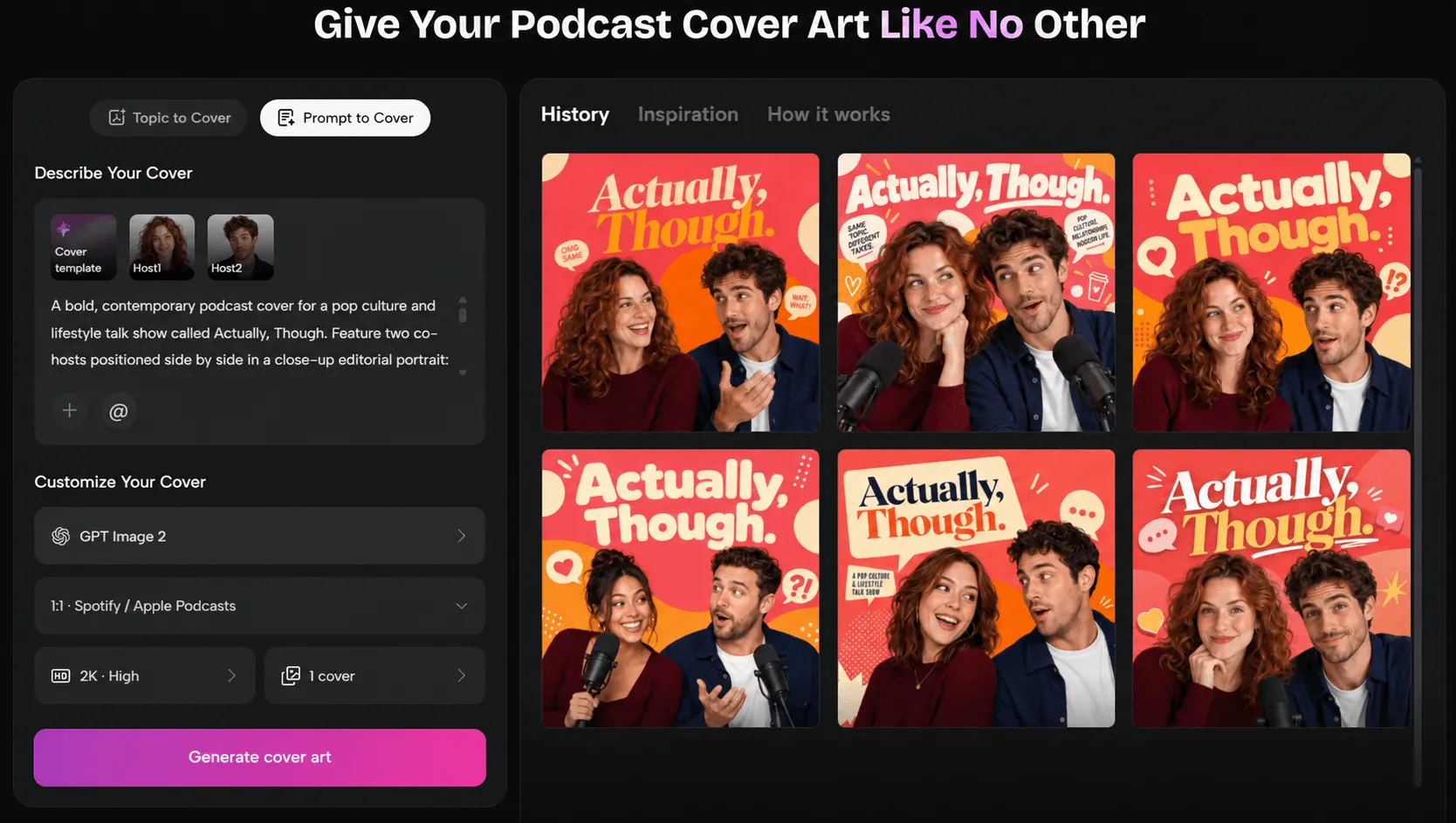
For the final version, I chose this design because every element serves a purpose. The magazine-style serif title and punchy speech bubbles set up the dynamic perfectly, while keeping the faces clear for thumbnail sizes.
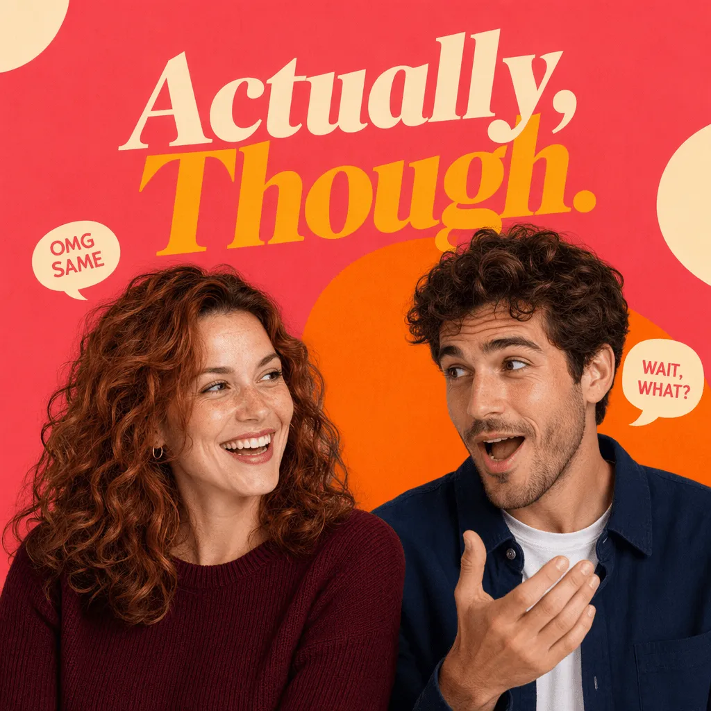
4. Check the result before you use it. Before exporting, I checked the title spelling, made sure both hosts looked natural, and confirmed that the artwork still reads clearly when reduced to a small podcast thumbnail. The contrast between the text and background matters just as much as the image itself.
For the final file, I used a 3000 x 3000 px square image in JPG or PNG format, in sRGB color. I also checked that the exported artwork met the platforms’ requirements before uploading it.
When you’re ready to create your own, the Podcast Cover Generator brings these steps together in one place. You can start with a topic, guide the artwork with a detailed prompt, add host references, and explore different cover directions without having to build the entire design from scratch.
Adapt Your Podcast Cover into Consistent YouTube Thumbnails
A strong cover gets attention. A consistent visual system helps listeners recognize your show wherever they find it. The goal is not to copy the same cover for every episode, but to carry forward the visual details that make the show unmistakably yours.
To test this, I uploaded the finished Actually, Though. cover to the tool and asked it to create thumbnails for two fictional episodes: “Why We Ghost” and “The Group Chat Rules.”
I started by spelling out the elements that needed to stay consistent: a 16:9 episode thumbnail in the same visual style as the uploaded cover art, with the same coral-pink background, warm orange organic shapes, cream circles, and cream rounded speech bubbles with coral text.
That instruction does most of the work. The uploaded cover establishes the overall identity, while naming the specific colors, shapes, and graphic details keeps the style from drifting. It also makes you think carefully about which parts of your cover are doing the real branding work.
From there, the prompt only needed the episode-specific details: the title, how Emma and Jack should react, the two lines for the speech bubbles, and one prop connected to the topic. The visual framework stays the same; the story changes.
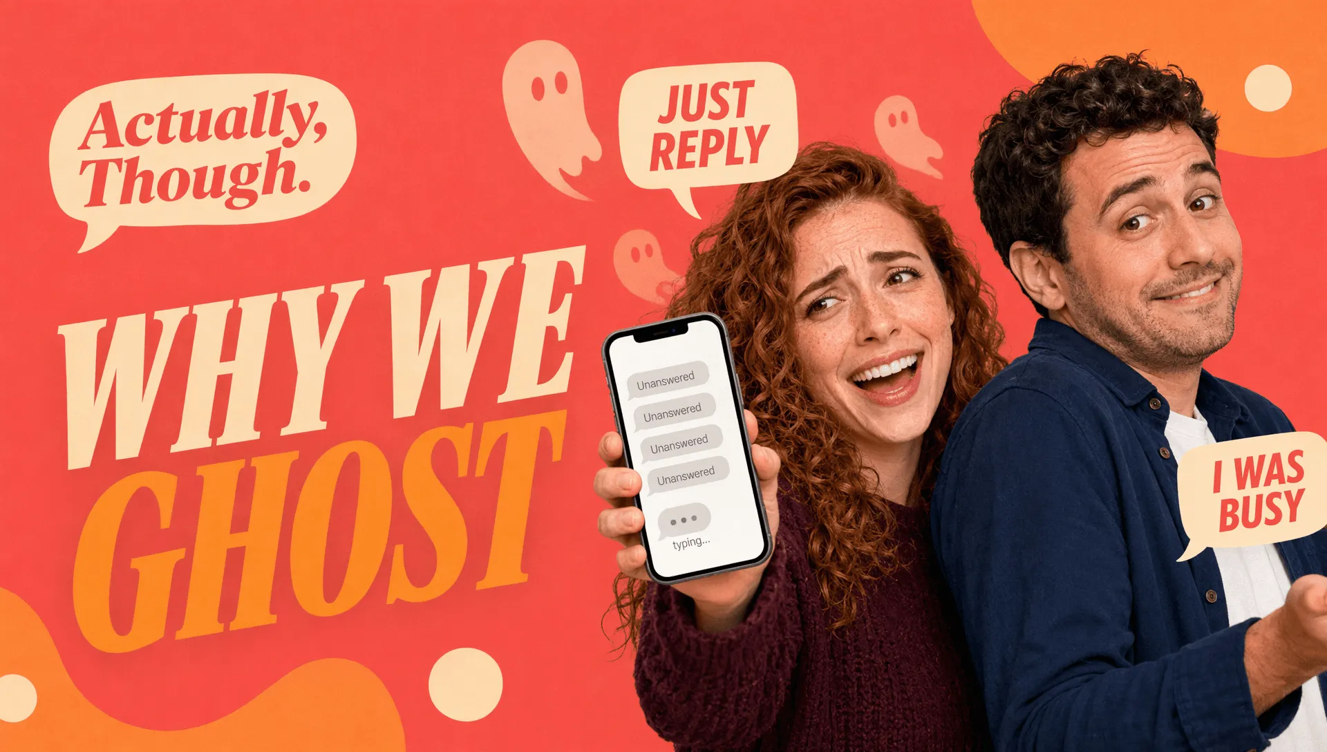
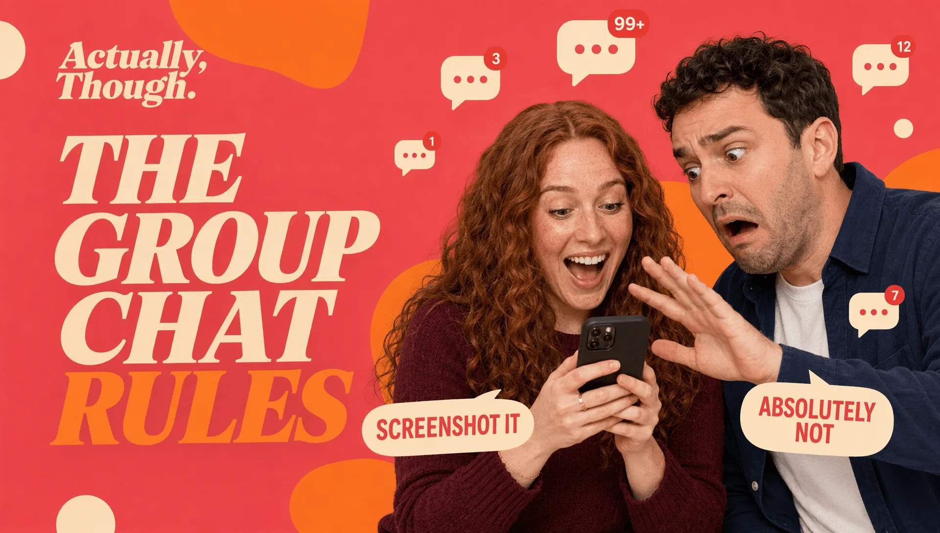
Four things hold steady across both: the coral and orange, the italic serif title, Emma and Jack, and the layout, with the logo at the top left and the two hosts on the right. Everything else moves.
Worth clocking the shape, too. These are 16:9, so they’re ready to go as YouTube thumbnails, and a wide frame flips the pecking order: the episode headline takes over and the show name shrinks to a corner mark. Someone scrolling a video feed wants to know what the episode is about before they care whose show it is. Same brand, different job, and the Podcast Cover Generator will give you either ratio off the same prompt.
Podcast Cover Art Checklist Before Publishing
Run this once before every upload.
-
Specs. Square, 3000 x 3000, JPG or PNG, RGB, no transparency or alpha channel. Compressed enough to load quickly on mobile.
-
Spelling. Read every word on the image out loud, including your own show name. Typos survive a surprising number of approvals.
-
Thumbnail legibility. Shrink to roughly 150 pixels and view it beside other shows in your category.
-
Cropping and overlays. Check that nothing essential sits at the extreme edges or in the lower portion, where app interfaces, play buttons and duration labels tend to land.
-
Series consistency. Cover the show name with your thumb. From layout, color and type alone, would a regular listener still know this is you?
-
Rights. Confirm you are cleared to use every photo, illustration, typeface and likeness on the cover, including guest images. A commercial font license is not the same as a free download.
FAQs About Podcast Cover Art
Can I use AI to create podcast cover art?
Yes. Directories set technical requirements for artwork, not rules about how the image was produced, so an AI-generated cover is published the same way as any other. There are two practical cautions: check the terms of the specific tool you use for what rights you hold over the output and whether commercial use is permitted; also review generated text carefully, since image models frequently produce malformed lettering. Many creators generate the imagery and set the title type themselves for this reason.
How much text should a podcast cover include?
Your show name, and little else. If an episode needs a line, keep it to roughly three to five words at a size that survives a thumbnail. Drop the word “podcast,” drop taglines that explain the premise, and drop episode numbers, since directories display titles and numbering next to your image already. Spotify’s guidance of no more than two typefaces is a good ceiling.
Can I change my podcast cover after publishing?
Yes, and shows redesign regularly. The mechanics depend on how you publish. If Spotify hosts your show, you update the art in your settings and the change typically appears within about 24 hours. If you publish through an RSS feed, your host updates the artwork URL in the feed and directories pick it up on their next crawl, which is not instant. One practical detail from Apple’s requirements: when you change artwork, change the file name and URL at the same time rather than overwriting the file at the same address, or caching may keep serving the old image. Worth knowing that a cover change costs you recognition for a while, so make it count rather than tweaking often.
Do I need separate artwork for YouTube?
If you publish a video version, yes. Podcast covers are square and video platforms use a 16:9 frame, so a square cover will either be cropped or letterboxed into dead space. You do not need a different design, just a different composition of the same design, with the artwork extended horizontally and the title repositioned for the wider frame. Generating the 1:1 and 16:9 versions together from one idea is the simplest way to keep the audio and video versions recognizably the same show.