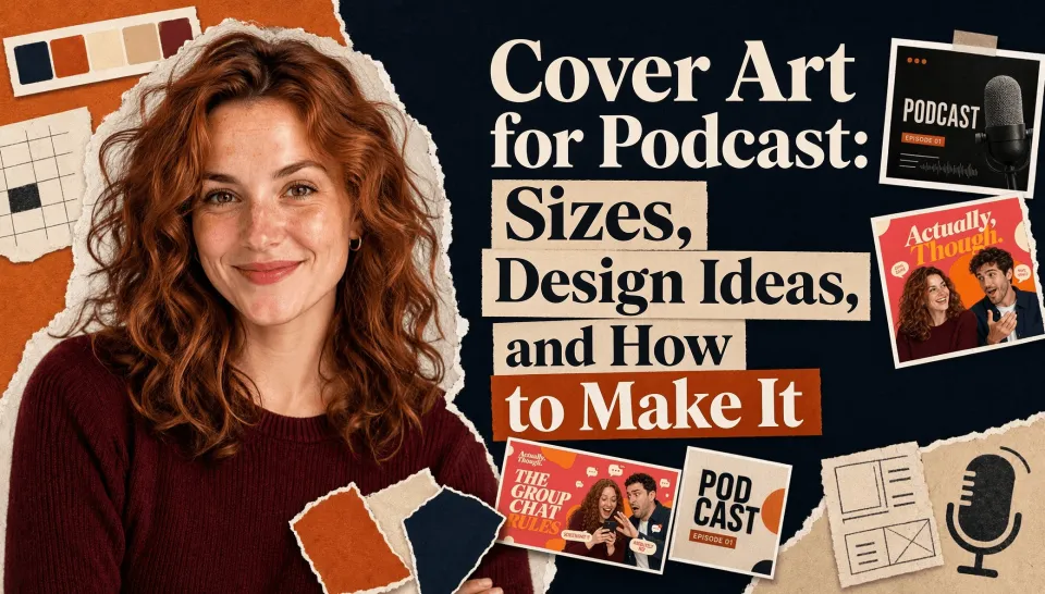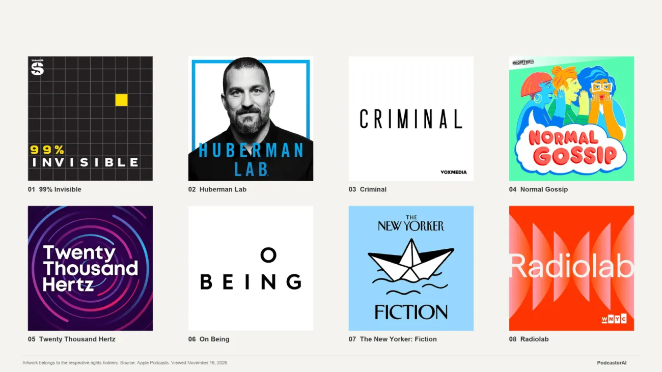

The most useful podcast cover art ideas start with a choice: should listeners notice your title, your hosts, or a visual clue about your topic first? Pick one, give it room, and make sure it still reads when the cover is small.
Below are eight design directions, each illustrated with an original cover concept and a practical way to adapt it. Use them to find a look that fits your show before you choose fonts, commission artwork, or start generating images.
Cover artwork belongs to its respective rights holders and is shown to discuss the individual designs. Sources appear beneath each image.
What makes good podcast cover art?
Podcast cover art is the main image that represents a show in podcast apps and other listening spaces. A good cover makes the show name easy to read, gives a clear sense of its subject or tone, and stays recognizable at a small size.
Start with three priorities:
-
A clear title. Let the show name take more space than a tagline, host credit, or production logo.
-
One visual focus. Choose a face, an object, a scene, or the lettering itself as the main attraction.
-
A repeatable identity. Keep a few elements consistent across releases, such as your title treatment, colors, or illustration style.
Apple Podcasts’ Show Cover guidance also emphasizes a prominent title, strong contrast, limited additional text, and artwork that remains legible at different sizes.
Before choosing a style, decide what the artwork represents. Your show cover introduces the whole podcast. Episode artwork can highlight a particular guest or story. A video thumbnailintroduces a specific video and may need a different composition. A guest portrait that suits one episode may not make sense as your permanent show identity.
8 podcast cover art ideas from real podcast examples
1. 99% Invisible: give a simple structure one memorable detail
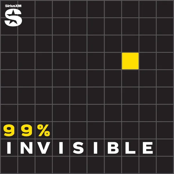
Artwork: 99% Invisible. Source: Apple Podcasts show listing.
Most of this cover is a dark grid, interrupted by one yellow square. The yellow “99%” at the bottom repeats that accent, while “INVISIBLE” appears in white.
The distinctive detail is the interruption: a regular pattern gives one changed element something to stand out against. The image can suggest finding an overlooked detail in an ordinary environment. That is a reading of the design, rather than a statement of the designer’s intent.
Useful for: design, cities, architecture, and shows that approach larger subjects through small observations.
Try it: Start with a grid, repeated line, or pattern. Change one element in a way that connects to your subject. Develop your own shapes and palette.
Watch for: copying the yellow-square identity rather than adapting the underlying idea of a meaningful interruption.
2. Huberman Lab: make the host the focal point

Artwork: Huberman Lab. Source: Apple Podcasts show listing.
A large black-and-white portrait fills most of the cover. The blue frame and blue show title create a consistent accent around the face and across the lower part of the image.
The portrait supplies a person to recognize; the lettering confirms the show name. A quiet background keeps those two elements prominent.
Useful for: expert-led discussions, coaching, personal commentary, and shows built around a recurring host.
Try it: Choose a portrait with a clear face and silhouette. Decide the crop before adding the title, and leave room for lettering when taking the photograph.
Watch for: a full-length photograph that leaves the face too small. If new listeners do not know the host, the name and subject cues still need to do some work.
3. Criminal: let space give the title room
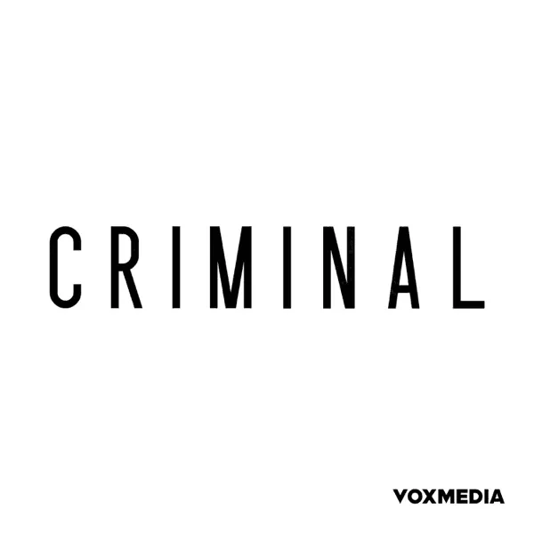
Artwork: Criminal. Source: Apple Podcasts show listing.
This version of Criminal’s artwork uses a white background, a narrow black title, and a small publisher mark near the bottom. There is little else to compete for attention.
The hierarchy is direct: the show name is the first substantial thing to read. With so few elements, the letterforms and spacing carry much of the design’s character.
Useful for: a short, clear show name and a restrained visual identity.
Try it: Begin with the title alone. Adjust its size, spacing, and position before deciding whether the artwork needs an image. Review what happens when you remove secondary text.
Watch for: assuming that an established show’s recognition comes with its minimal layout. A new podcast with an abstract name may need a visual cue to help explain the premise.
4. Normal Gossip: show the interaction
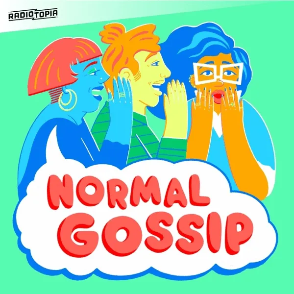
Artwork: Normal Gossip. Source: Apple Podcasts show listing.
The bright palette includes green, blue, yellow, and red. More specific than the colors is the action: three illustrated people whisper, listen, and react. The white speech shape below gives the red title a relatively clear reading area.
The design turns conversation into a visible situation. The poses communicate an exchange even before the title supplies its name.
Useful for: friendship, everyday stories, comedy, relationships, and informal conversation.
Try it: Pick an action that reflects your speakers’ dynamic, such as sharing a secret, debating, or gathering around a table. Let expressions and posture carry some of the message.
Watch for: losing the title among bright colors, expressive faces, and decorative lettering. A lively illustration still needs a clear text area.
5. Twenty Thousand Hertz: give an abstract subject a shape
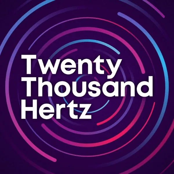
Artwork: Twenty Thousand Hertz. Source: Apple Podcasts show listing.
Circular lines spread around a stacked white title on a dark purple background. Their blue, purple, and pink variations suggest movement, vibration, or sound spreading outward.
The abstract image offers a connection to the subject while keeping the words substantial. At a smaller size, the fine lines can become less distinct, but the title retains a place of its own.
Useful for: sound, music, science, technology, and explainers about abstract concepts.
Try it: Describe the connection between your topic and a proposed symbol in one sentence. Branching paths might suit decisions; intersecting lines might suit connections. Develop one metaphor clearly.
Watch for: treating glowing lines or gradients as a substitute for an idea. The shape should relate to the subject, rather than function as a generic technology background.
6. On Being: shape the pace with spacing
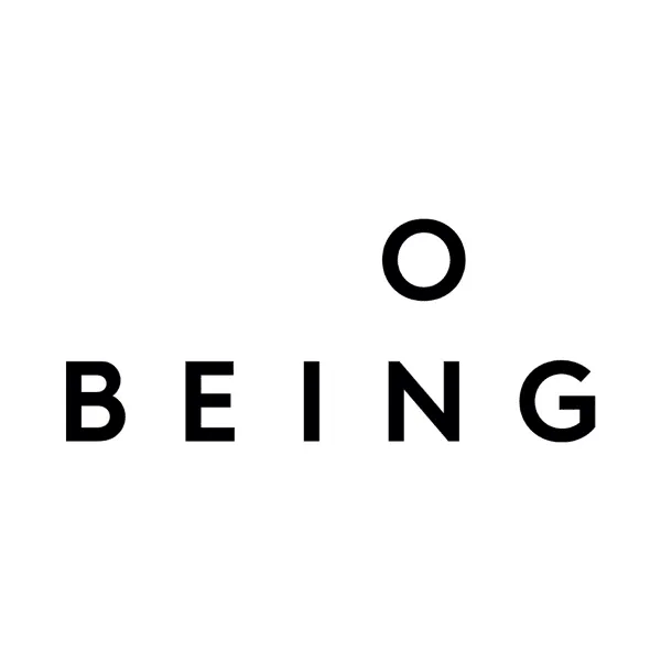
Artwork: On Being with Krista Tippett. Source: Apple Podcasts show listing.
A circular letterform sits above widely spaced “BEING” lettering. The black-and-white contrast is clear, with ample room between the letters and around the composition.
Like Criminal, this cover uses few elements. Its rhythm is different, though: the space between the letterforms becomes a conspicuous part of the image. Minimal covers can have different personalities.
Useful for: thoughtful interviews, philosophy, reflection, and a quieter visual tone.
Try it: Test the same title with several arrangements of letter spacing, line spacing, and position. Keep enough weight in the type for the name to remain clear.
Watch for: splitting or reshaping a new show’s title so much that an unfamiliar reader cannot reconstruct its name. Spacious lettering still needs to communicate.
7. The New Yorker: Fiction: let one illustration carry an association

Artwork: The New Yorker: Fiction. Source: Apple Podcasts show listing.
The cover has three levels: the publication name at the top, a paper boat in the middle, and “FICTION” below. A light blue background keeps the black-and-white illustration distinct.
The boat can evoke paper, imagination, or a journey. One simple object gives the reader room to make an association without requiring several story scenes or a page of text.
Useful for: literature, reading, culture, narrative history, and a recurring editorial series.
Try it: Choose an object connected to your content that has a clear silhouette. Give the brand name, show title, and illustration separate roles in the layout.
Watch for: giving an unfamiliar parent brand too much space. Borrow the hierarchy, then adjust it to how much explanation your own show needs.
8. Radiolab: build an identity with repeated shapes
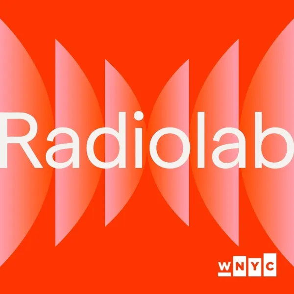
Artwork: Radiolab. Source: Apple Podcasts show listing.
Pink curved forms face inward across an orange-red background, while a pale show name stretches horizontally through the composition. Color, repetition, and title placement work together as an identity.
The shapes can suggest waves or movement without depicting a particular episode topic. That gives an abstract direction room to represent a show covering several subjects.
Useful for: science and culture exploration, varied knowledge topics, and an enduring visual identity.
Try it: Choose one shape and palette, then test how they work on a square cover, episode artwork, and a horizontal image. Keep a common structure while varying the details.
Watch for: abstract forms competing with the title. When extending your own design across formats, keep a clear area for reading.
Which podcast cover design fits your show?
Choose a direction based on the reason someone would listen. Genre can guide your research, but your show’s particular promise should determine the visual focus.
| What draws people to the show? | Example to study | Principle to adapt |
|---|---|---|
| Finding overlooked details | 99% Invisible | A meaningful change within a regular pattern |
| A recurring host’s expertise or personality | Huberman Lab | A clear portrait and a consistent accent color |
| A short, clear show name | Criminal | Title-led hierarchy and generous space |
| Interaction between speakers | Normal Gossip | Gestures and expressions that communicate a dynamic |
| Understanding an abstract subject | Twenty Thousand Hertz | One visual metaphor tied to the topic |
| Quiet, reflective conversations | On Being | Letter spacing and room around the title |
| Literary or cultural stories | The New Yorker: Fiction | One symbol with a clear editorial hierarchy |
| Exploration across several subjects | Radiolab | Repeated shapes, color, and title placement |
If you are comparing podcast cover art ideas, make two rough versions before polishing either. View them small, then ask someone unfamiliar with the podcast what kind of show they expect and what they noticed first.
Still refining the name? Browse these podcast name ideas before committing to a layout. A two-word name and a longer title need different arrangements.
Podcast cover art size: what should you export?
For an Apple Podcasts show cover, prepare a 3000 × 3000-pixel square PNG or JPG with a solid background. Apple accepts artwork from 1400 × 1400 to 3000 × 3000 pixels when submitted through RSS and prefers the largest size.
| Item | Apple Podcasts show cover specification |
|---|---|
| Preferred dimensions | 3000 × 3000 pixels |
| Accepted dimensions through RSS | 1400 × 1400 to 3000 × 3000 pixels |
| Shape | Square |
| File type | PNG or JPG |
| Transparency | No transparency or alpha channel |
| Placement | Keep important content within Apple’s template safe area |
Source: Apple Podcasts Show Cover specifications.
Check your host and each destination’s current requirements before uploading. These specifications apply to Apple’s show cover; episode images and video thumbnails can have different requirements.
For a video version, rearrange the title and image to suit the destination. Our YouTube thumbnail guide covers that separate design task.
Turn a design direction into your own cover brief
Write down the decisions behind your chosen direction before opening a design tool. A brief helps you explain an idea and judge what needs to change.
-
Name the audience and promise. Write one sentence about who listens and what the show gives them.
-
Choose a primary focus. Pick the title, a host, or an image related to the subject.
-
Define the mood and composition. Describe the colors, tone, and arrangement of text and imagery.
-
Supply the exact wording. Separate the essential show name from optional supporting text.
-
Check a small preview. Try roughly 100 × 100 pixels to review title and subject clarity. This is a practical design test, not a platform requirement.
For example, an original brief for a show about everyday city details could read:
Create a square cover for a podcast called “Street Corner Stories,” about overlooked details in everyday city life. Use simplified street lines and one prominent window shape, with deep blue and warm white. Make the title clear and prominent, with minimal supporting text. The mood should feel curious and restrained.
This adapts a design principle to a new subject, symbol, and palette. You can use your brief with a designer, a design editor, or the PodcastorAI podcast cover generator. Start from a topic or prompt and add your own host images or relevant reference materials. Review generated text, faces, and the downloaded file’s actual dimensions.
Frequently asked questions about podcast cover art
Should I put my face on my podcast cover?
Use a portrait when the host’s expertise, experience, or personality is a central reason to listen. A story-led or topic-led show can instead use an illustration, symbol, or strong title treatment. The right focus depends on what the listener comes for.
Does every podcast episode need a different cover?
You can establish recognition with a stable show cover, then create episode artwork when a guest or topic benefits from it. Keep common elements such as the title style, palette, or layout. Check how your host and listening apps support and display episode images.
Is a minimal cover better for a new podcast?
A minimal layout can reduce distractions, but the title and type must carry more information. A new show with an abstract name may still need a clear subject cue. Test whether an unfamiliar listener can read the name and understand something about the premise.
Can I use AI to create podcast cover art?
Yes. AI tools can help explore concepts from a topic, title, prompt, or reference image. Give the tool a specific subject and composition, then check title spelling, faces, and other image details. Add or correct lettering in a design editor when needed.
How do I make my podcast cover recognizable?
Give the cover one clear focal point, maintain strong contrast, and choose a distinctive detail connected to the content. Keep that detail consistent across releases. Study the principles behind other shows’ covers, then develop a title treatment and imagery that fit your own podcast.
Start with the direction that best expresses your show’s promise. Make one rough version, check it small, and refine what the listener notices first. When your brief is ready, create your podcast cover with PodcastorAI.